top of page

Total Movie
Video On Demand
for Web and Mobile
Cross Platform Device UI Design
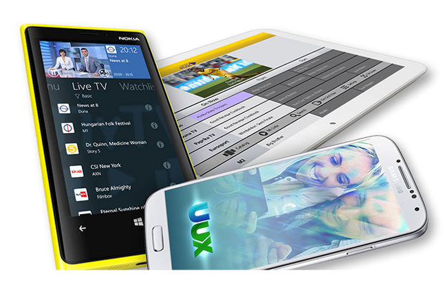
The app was fitted to various mobile devices and operation platforms. The best practices for google's material design patterns and icons were adopted to optimize for phones and tablets operating android.
Later it was adopted to the windows metro design system, emphasizing tiles, abstract layout and specific typography. The navigation was reworked to fit the single space panorama controls supporting
pivot headers.
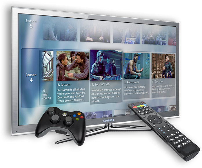
The OTT service was also available for set top boxes and game consoles. The navigation and interaction pattern had to be mapped to the remote controls for each of these devices. Various TV remotes featured specialty buttons upon which the functionality of the app could be expanded.
Interaction Design
for Remote Controls
For the sign
up process a responsive web page was created. Three breakpoints determined layout and functionality adjustments to fit on to Web, Tablet and Phone screens.
Together with the marketing department the messaging, look & feel and central sign up elements were designed to appeal to the latin american market.

Responsive
Splash Page
Rebranding & Localization
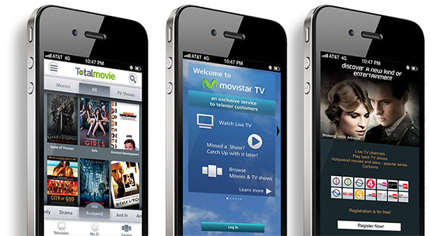
Phone carriers in Brazil, Mexico and Hungary adopted the TotalMovie OTT service. The UI was reskinned for each market to reflect the look & feel of each provider's brand.
A challenge was the design of buttons and navigation controls to accommodate multiple languages. Extra spacing between graphical elements avoided layout errors for each localized app instance.
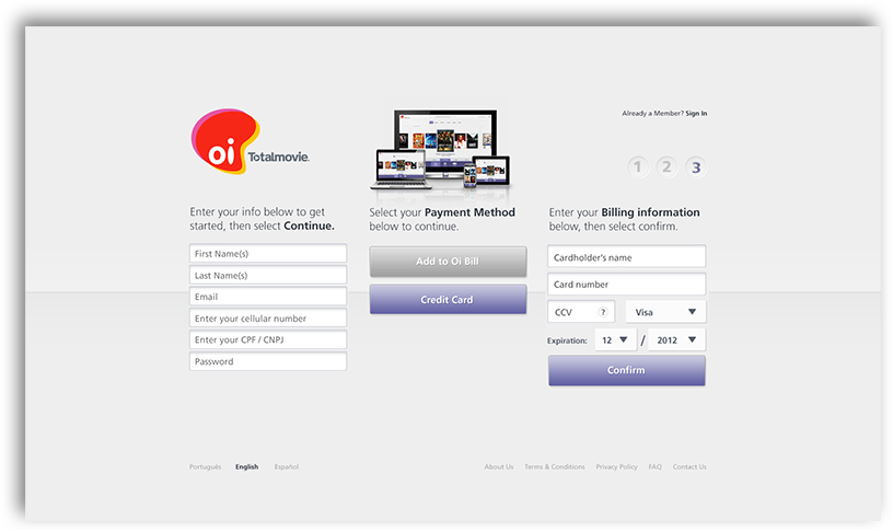
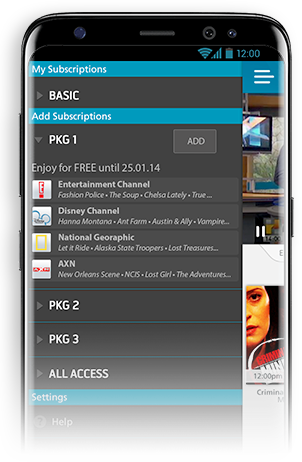
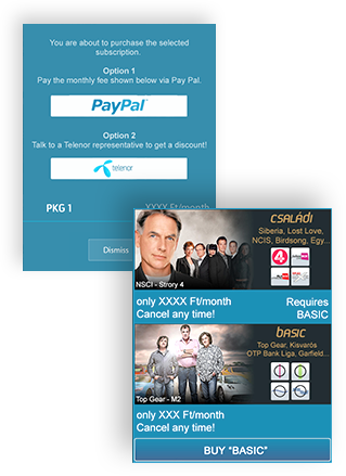
The service allowed for multiple payment options. In order to aide the conversion process, the payment flow had to be as simple as possible. In other markets the user was able to add subscription fees to their provider's phone bill.
Throughout the app upsell and package deals were advertised via banner ads and pop up windows. In the drawer area of the mobile app the user was able to select individual packages. The design aimed for an ux flow with the lowest possible click through rate to allow for a quick and easy transaction.
Registration & Payment Flows
In App Purchases
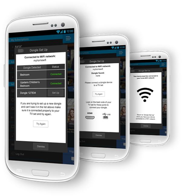
The app was compatible with several hardware devices like dongles for casting video to a TV set. However this required some effort to set up. A sequence of screens were designed to take the user step by step through the process. The use of easy to recognize icons or the graphical representation of various cable plugs made it more intuitive to follow. The written instructions were kept to a minimum for simplicity and to better highlight the action button of each screen. The goal was to make the user feel that at any time he or she is in control of the process.
Wizards for
Equipment Set Up

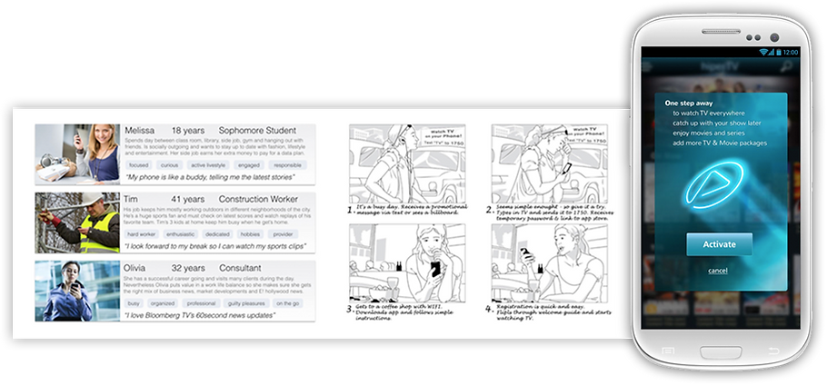
User Journey Diagram
to Outline Each Step of the Registration Process
Designing a unique catalogue browsing experience
"Gestalt principles are laws of human perception that describe how humans group similar elements, recognize patterns and simplify complex images when we perceive objects"
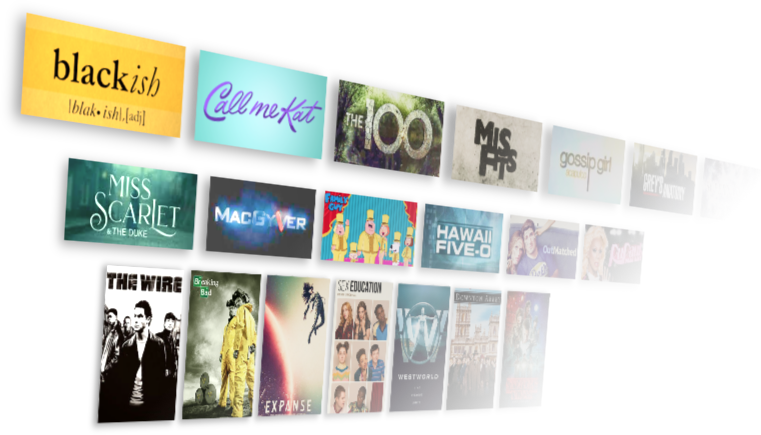
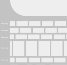
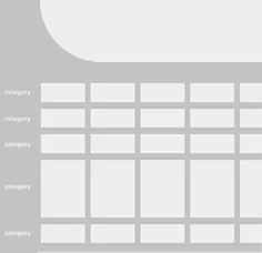
Traditional video libraries just present a homogeneous grid of movie or tv show thumbnail pictures. Category headers are the only visual separators for the user to identify a new section of content.
The "Law of Common Region" is the most relevant of the "Gestalt Principles" that influence the layout of a media catalogue browsing experience. A study experimented also with motion to enhance the easy recognition of distinct group in a visually cluttered environment. Not only created the spacial offset between rows an enhanced separation of categories, but also a slightly different speed at which each row was slowly moving across the screen.
In order to "suggest" the user certain contents without adding any extra graphics that could further clutter the appearance of the media grid, selected thumb nails would rotate in 3d space from one poster to another. This creates an animation that stands out from the overall horizontal drift and immediately draws the attention of the user.



bottom of page