

Trip Deal Maker
Applying human-computer interaction patterns and best practices to the design of a web based travel service.
Just tell YouGo! what you can afford and provide some basic information.
Call to Action (CTA)
YouGo! proposes travel packages based on one's budget instead of asking for a destination. This is conveyed through 4 simple questions with oversized input boxes next to them. It's immediately obvious to the user where to start. To minimize the "threshold" of data entry, each input field is prefilled with data based on most probable values or cookies. This potentially allows the user get started by only entering the budget and travel time.
inline edit
modal window
This approach allows a minimum of mouse movement. The edit area opens in the adjacent space of the clicked input field. This is true for any of the other input fields as well, therefore always keeping any relevant button in immediate proximity of the current mouse position,
Instead of an entry field one clicks on an edit button to open a modal dialog window. It forces the user to move the mouse along greater distances around the screen. The user would also have to aim at more targets to click.
vs

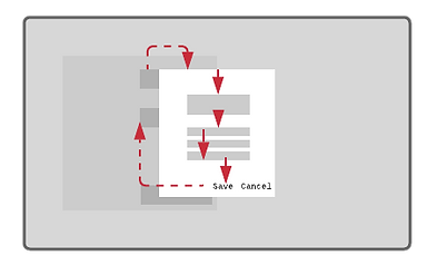
Quick & Easy Data Entry through Inline Edit Style UI
Since each answer can be further refined, all additional options are revealed next to the respective input field. This follows one of the best design practices called "Fitts' Law", which suggests to maximize all click targets in their size and place them at a minimum distance to the mouse position.
Each of these sub-choices have a default value, so the user is not forced to answer them. Most have a "YG! Wildcard" option, that automatically suggest any available option based on the entered budget.
YouGo! searches a variety of travel services for transportation and accommodations to create a comprehensive travel package along your specified preferences.
Emotional Engagement through Images
A travel site is the gate to all the amazing places in this world, where people want to spend their precious vacation time. There is no better way to convey this through images that engage and excite. Any travel site relies on the power of a compelling photograph and YouGo! shall be no different. The image occupies the entire top space of the page and serves as the background to all interactive elements of the user experience. Smaller image cards are arranged in the lower part of the page, for the user to browse and get inspired.
Simple Navigation & Exploration
A simple navigation is key to a good user experience. A typical travel site reveals an endless list of results with numerous filters and switches on the side. The YouGo! site limits the space for displaying results to the right space of the page with a simple tab menu on top. Although this might increase click and scroll actions, the goal of this design is to create focus. It also intends to counteract the "Paradox of Choice" problem, which states that the more choices are presented to a customer, the less likely they will choose a satisfactory outcome (e.g. endless browsing of the Netflix catalogue).
focused result area
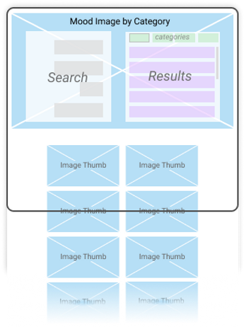
The layout limits the space of the area displaying a list of results. A simple tab navigation at the top lets the user browse between easy to identify categories. Only five to six results are visible at a time. It creates a focus on each individual result which might enable the user to make a choice quicker.
vs
endless list of results
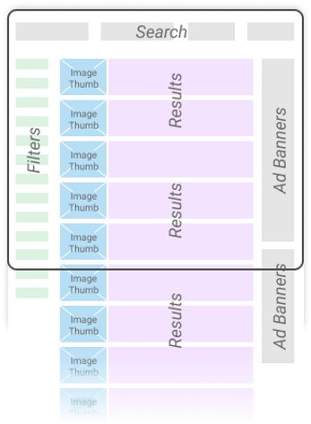
The typical layout of a standard travel site has a high density of information, tools and graphics. Results can "overwhelm" the user, amplifying the "Paradox of Choice" problem. One might find it harder to make a choice as a large number of filters keep changing an endless list of results.
Page Responsiveness and Loading Speed
The YouGo! algorithm simultaneously searches for transport and lodging options. It then combines them into individual travel package deals, matching the entered budget. This causes a certain amount of latency until all results are loaded. For a modern website every millisecond counts, otherwise it will risk losing the user's attention. Skeleton Loaders have two advantages: they give feedback, indicating that the site is working while also successively revealing each result as it becomes available. This allows the user to click on a travel package before the algorithm has completed processing the query.
YouGo! allows to fine-tune each travel package via it’s money-spending slider
while making sure you’re staying within your budget.
Organizing a Content-Heavy Web Page
The vacation package page has to display multiple items: a summary, the Money Spending Slider, the transportation details, the accommodation information and links to other packages. Following the gestalt principle of proximity, all elements belonging to an item were grouped into a grid of boxes: two full width areas on top for the summary and slider and two columns for transportation and accommodation below. Due to the amount of content, there was not much white space available to visually separate each group from another. Therefore clearly visible rectangular background spaces were organized into a bento box style pattern.
Tool Design: The Money Spending Slider
YouGo! allows the user to finetune a vacation package. Either more money is spent on transportation and less on accommodations, vise versa or money is spend at an equal amount. Radio buttons or toggle button groups are typically used for switching between settings. However this control must clearly convey its function and current setting. As a result, a three step slider with a custom designed track stretches across the transport and accommodation columns. The position of the slider knob is either above one or the other column or in the middle, showing the user instantly their money-spending preference.

Animating Microinteractions
There were several problems to be solved due to the complexity of the vacation package page. First was the page loading. Besides the aforementioned skeleton loaders, some of the key elements had to be emphasized for getting the user's attention. A subtle animation sequence was used to make the Money Spending Slider tool appear. First the track expands from the center into both directions. Second the knob with a dollar symbol scales up to its size.
It was important to have the "BOOK IT!" button appear as the last element. A quick scale bounce motion draws attention to ensure that the user knows where to click once they have decided to book this vacation package.
Now that you found the right trip, YouGo! makes it easy to select from valuable services to enhance or protect your vacation.
Exit through the Gift Shop
It's important to clearly mark the total payment before the user proceeds to final check out. This was achieved by aligning all possible add-on service prices to the right, so all money values are stacked on top of eachother like in an equation. The final price is included into the CTA button design itself. This makes the user less hesitant to click this button as it is clear what to expect.
compact price adding

By maintaining the focused results area, any additional services the user might choose to add to the total price allows a clear display of the extra costs. The selected product and its associated price are shown in a horizontal proximity whereas the money amounts form an easy to understand equation in the vertical.
vs
lazy scrolling patterns
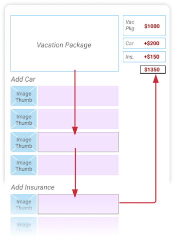
For a typical travel site the extra services are listed below the selected package which forces the user to scroll. This moves the package information out of sight as well as forces the user to move the mouse around at greater distances.
Consistent User Experience
Just like the budget amount is entered on the homepage in order to find a matching vacation package, the ad-on services offer the same feature. A labelled large input field to the left of the car and insurance area signifies the same kind of interaction the user encountered at the beginning of the YouGo! journey.